Summary
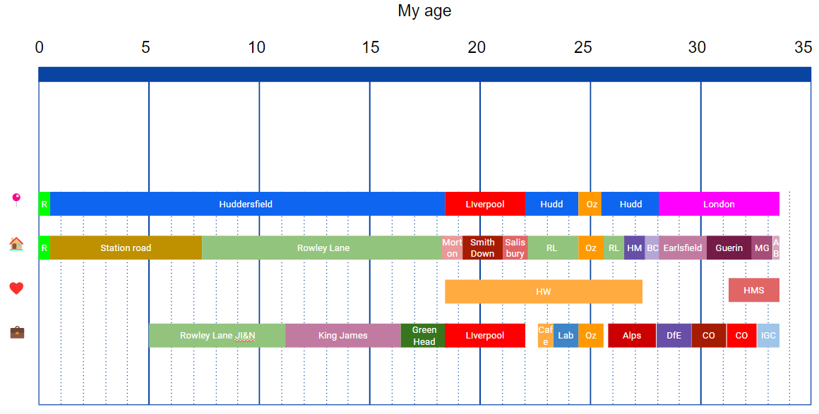
I created a graph showing:
where I lived
who I was in a relationship with
what I was working on or studying
It’s cool
You can copy my template here
I created this graph
I like creating graphs about things that are important to me. My whole life is one of the most important things to me. So I recently tried to create a graph of the whole thing. It’s necessarily simplified in parts, but I’ve found it really helpful for putting many things into perspective. A lot of the words/acronyms/colours will only mean things to me, but I thought it worth showing it all:
These are the most significant (and easy to neatly categorise) parts of my life.
📍Town/city. (except “Oz” which is the year or so that I spent travelling in Australia)
🏠House/flat
🧡 Long-term romantic relationships
💼 School/job
Key things I learnt from this:
London is now the place I have lived longest other than my home town. I tend to see moving to London as a very important moment in my life. This emphasises that.
I’ve moved houses a lot. People feel like home, buildings do not. (you also can see the 2 times I moved back in with my parents in Rowley Lane)
That first relationship lasted a long time. I mean, I knew we were together for 9 years, but it's surprising to look at. It’s still the majority of my adult life.
My initial struggles to establish a career seem brief on this time scale. They felt extremely bad at the time (see the ~year of unemployment after graduating from uni - it sucked).
I made another graph
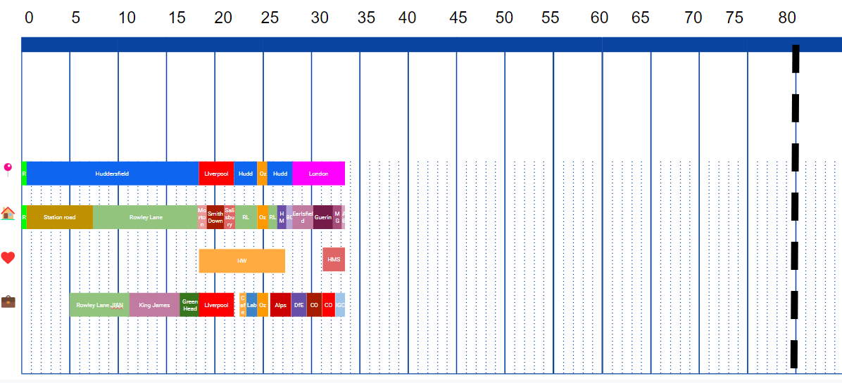
I wanted to put my life so far into perspective even more:
The dashed black line is my expected age of death!
I wonder if the next ~40 years will be equally colourful…
If you want to make your own one of these:
I’m really keen to see other people make these. It was pretty easy and very fun. Here is a template - just make a copy of the presentation, then copy, paste, and resize the boxes. Then show me please! :)


